

HomeHub Experience Redesign
A research led redesign of a broadband bundle flow that was losing 85% of customers before checkout.

Eighty Five Percent
That was the pre cart abandonment rate on HomeHub, StarHub's broadband and entertainment bundle flow. Out of every hundred people who came to choose a bundle, eighty five left without reaching the cart.
The business read this as a conversion problem. It wasn't. It was a comprehension problem, and those are different things with different fixes. You can push harder on a page people don't understand and all you get is a faster exit.
Before any design started, I set the target: bring abandonment from eighty five percent down to seventy. Naming the number first meant every decision that followed had something to answer to. It also meant we couldn't quietly redefine success later to match whatever we happened to build.

02 / WHAT THE PAGE WAS ACTUALLY DOING
A brochure pretending to be a decision tool.
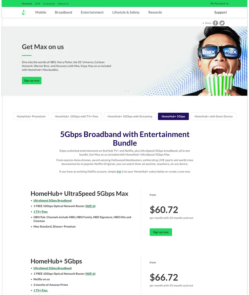
The existing page presented bundles the way the business thought about them, not the way a customer chooses one. Plans sat behind tabs, so comparing two options meant clicking back and forth and holding the difference in your head. Content hierarchy was flat. Nothing on the page helped a person work out which bundle was for them.
It told you everything. It just never told you what to pick.
03 / LOOKING OUTWARD FIRST
Competitive analysis: what the good ones do differently.
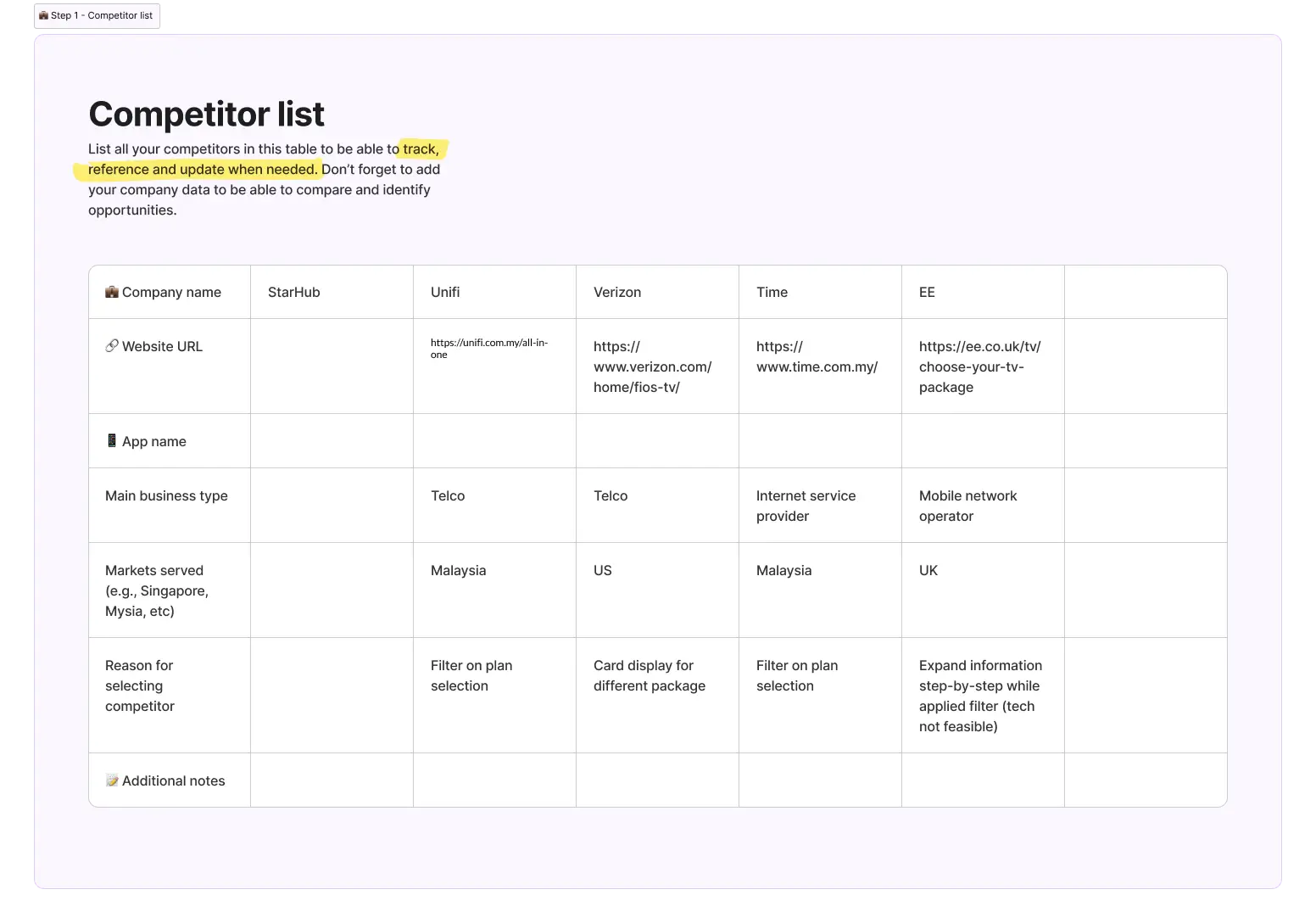
We reviewed bundle comparison across leading telcos. The pattern in the strong performers was consistent: side by side layouts that made differences visible at a glance, transparent pricing with nothing buried, and human categories that let customers self identify rather than decode a product matrix. "For families." "For streamers."
Ours did none of this. We had the same information. We just made the customer do the sorting.
This told us the fix probably wasn't more content or better copy. It was structural.
04 / TALKING TO CUSTOMERS
Twelve people, and one uncomfortable finding.

05 / FIRST ROUND OF TESTING
Watching people scroll up and down told us everything.
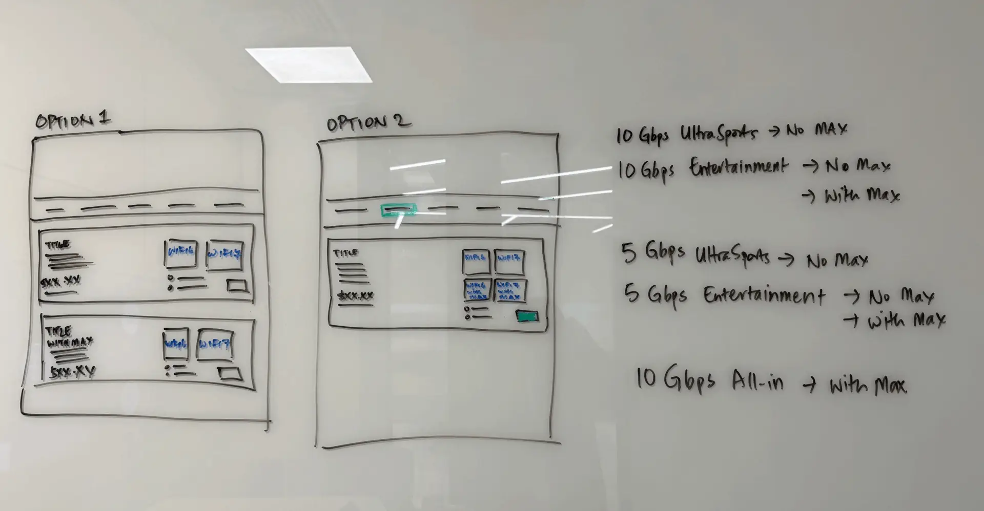
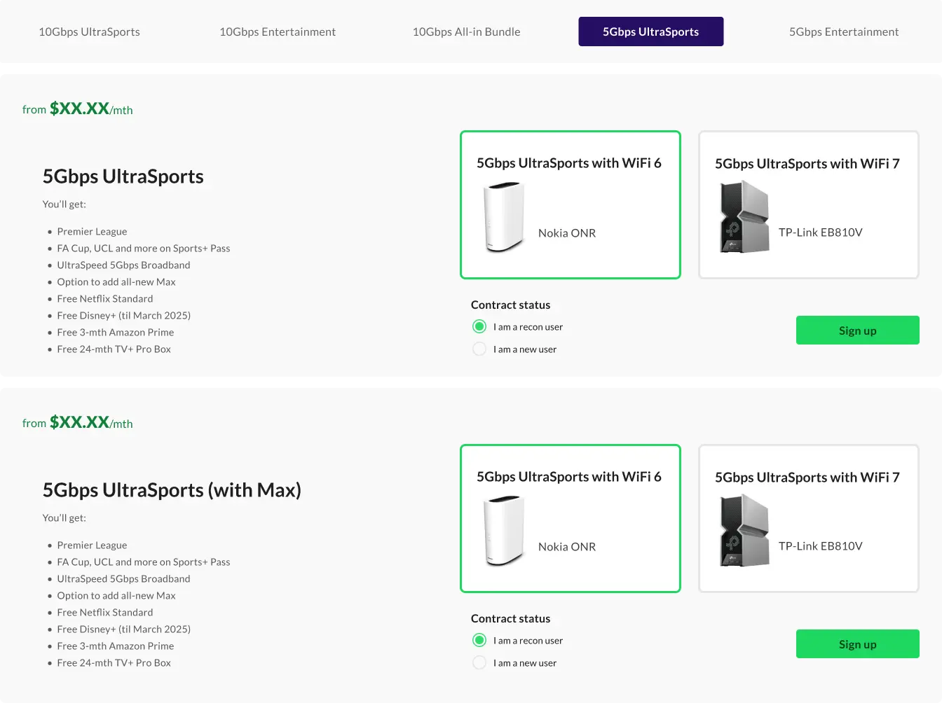
We built wireframes and put them in front of users. The first round tested two things: how the bundles were categorised and named, and how the plan cards presented information.
The most useful signal was behavioural rather than verbal. Participants scrolled up and down, repeatedly, trying to compare bundles. That motion is a tell. It means the differences aren't legible on a single screen, so people are compensating by building the comparison in memory.
Most participants made their decision based on the bundle name alone. Not the contents, not the price breakdown. The name. That's not because customers are lazy. It's because the name was the only element on the card actually doing any work.
The takeaway: unique benefits and add ons weren't being surfaced in a way anyone could act on. If a bundle was better value, the page was keeping it a secret.
06 / SECOND ROUND OF TESTING
How much information is too much?
The obvious response to round one would have been to add: more detail, more comparison, more explanation on every card. We tested the opposite hypothesis.
Two questions:
What is the right balance between too much and too little on the first view?
Would splitting the flow into two focused pages improve clarity, or just add a click?
The instinct in most organisations is that an extra step costs conversion. Sometimes it buys it. A page that asks for one clear decision, then a second page that supports it, can outperform a single page asking for everything at once.
07 / WHAT CHANGED
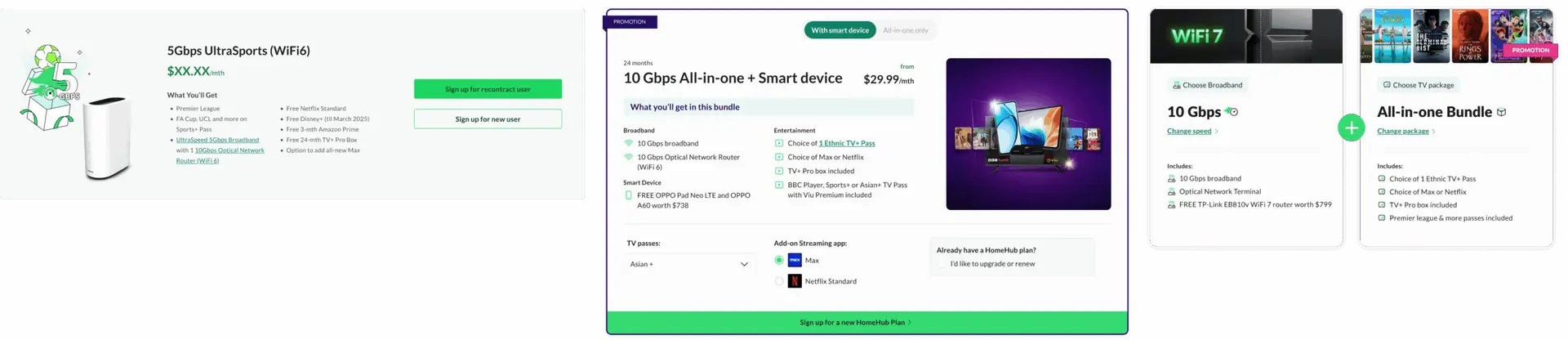
Three categories. Two screens. One decision at a time.
Categories, in the customer's language. Bundles were reorganised into three labels: Promotions, For TV Lovers, and For Sports Fans. Named for how people described themselves in research, not how the business organised its inventory. Self identification does the filtering work before comparison even begins.
Two screens instead of one. A landing page carrying just enough on each card to earn a click, and a comparison screen designed to make differences visible immediately. Splitting the flow reduced the load on the first decision rather than adding friction to it.
A feature carousel at the bottom. Supporting detail for people who wanted it, placed so it never interrupted the people who didn't. Depth available on demand, not imposed by default.


08 / WHERE IT LANDED
It shipped. Then I left.
The redesign went live. The plan was A/B testing and performance tracking against the seventy percent target, with click through from the landing page, engagement with the new layout, and bundle conversion as the tracked metrics.
I left StarHub before those results came in. So I can't tell you whether we hit seventy percent, and I'm not going to imply otherwise.
What I can tell you is this. Every decision in the final design traces back to something a real customer did or said in a testing session. The target was defined before the first wireframe, not reverse engineered afterwards to make the work look successful. And the design shipped instrumented, so the team that inherited it could actually find out.
Most redesigns cannot claim that. Most redesigns are a matter of taste, defended confidently, and never checked.
09 / REFLECTION
What I'd do differently.
The research should have come first, not second.
We ran competitive analysis before we talked to customers. It felt efficient. It wasn't. The competitive review told us how other telcos structure a comparison page, which is a useful answer to a question we hadn't yet earned the right to ask. Talking to twelve people surfaced that half of them didn't recognise the product names, and that reframed the entire problem from layout to comprehension. If I ran this again, I'd talk to customers first and use the competitive work to pressure test what they told us, not to set the direction.
We treated a recognition problem as a design problem for longer than we should have.
Six of twelve participants not knowing what Max was is not something you fix with card layout. It's a brand and marketing problem sitting inside a design brief. We surfaced it, and the design accommodated it, but the honest answer is that some of the abandonment on that page was never ours to solve. Naming that clearly to stakeholders earlier would have set better expectations about what a redesign could realistically move.
Splitting the flow was the right call and I was not confident about it.
Every instinct in a conversion driven organisation says an extra click costs you customers. Testing said the opposite: one clear decision, then a second screen that supports it, beat one page asking for everything at once. I'd have been talked out of it in a review meeting. The only reason it survived is that we had evidence, and evidence is what makes an unpopular decision defensible.
The thing I'd fight harder for: staying to see the number.
The design shipped instrumented, with a target defined before the first wireframe. Then I left, and I never learned whether we hit seventy percent. That's the part that still bothers me. Setting a measurable target is only half of the discipline. The other half is being there when the answer comes back, especially if the answer is that you were wrong.