


CNPS REDESIGN
Sole designer on a conservation platform. A rebuilt design system, five product workstreams, every decision tested before build.

One designer, one platform, nine months.
Calscape is the California Native Plant Society's gardening platform. It helps people find the right native plants for where they live and, increasingly, teaches them what to do next: how to propagate, how to maintain a garden, how to replace a lawn with something that supports local ecology.
CNPS set out to grow Calscape from a plant database into a full platform. Multiple new products, a rebuilt foundation, a fixed budget, and a defined timeline, with an external development vendor building production on a rebuilt WordPress and CMS stack.
I'm the sole designer on that work. Five product workstreams, a complete design system, and the research to make sure the decisions are right, delivered slice by slice to a team that builds from what I hand them. This is what I hand them: Figma files with full documentation, the master design system, and a working, deployed prototype that demonstrates every interaction. Not static screens and a hopeful conversation. A running reference.

02 / THE FOUNDATION: DESIGN SYSTEM
Everything on the platform sits on a system I rebuilt.
Calscape had a basic design system when I arrived. It wasn't enough to build a platform on. Inconsistent, incomplete, and never intended to carry the range of products now being added. So before designing features, I rebuilt the foundation.
The result is a tokenized system built for implementation, not decoration. Twelve color families, each with a full 100-to-900 tonal scale, every value documented in hex and rgba with primary steps defined. A complete typographic hierarchy in Poppins, from display sizes down to the smallest supporting text, across four weights. More than sixty components, each specified across every state and size it needs, on both light and dark surfaces.
Accessibility wasn't a pass at the end. The system had to meet WCAG 2.2, so contrast ratios were built into the tonal scales themselves rather than checked afterwards, and every interactive component was specified with the focus, state, and target-size behaviour the standard requires. Getting that right at the token level means the platform inherits it automatically. Getting it wrong at the token level means auditing thousands of screens later.
This is the artifact the development vendor builds from. A system precise enough that implementation is a matter of following it, not interpreting it. It's also the reason a solo designer can move across five workstreams in nine months without the platform fracturing into five different-looking products. The system holds it together.

03 / HOW THE WORK SHIPS
I don't hand off static screens and hope.
The hardest thing to communicate in a design handoff isn't how something looks. It's how it behaves. Where the motion goes, what happens on hover, how a state transitions, why a micro-interaction matters. Static files can't carry that, and the gap between what a designer intended and what a developer infers is where good design quietly dies.
So my handoff includes three things. The Figma files and full documentation, which specify the design. The master design system, which the developers build components from. And a fully functioning prototype, deployed on Vercel, that demonstrates every interaction and micro-animation in a running product.
The prototype does double duty. For the developers at Wave, it's a reference implementation: when they want to know how something should behave, they don't read a description, they use the thing. For CNPS stakeholders, it's how decisions get validated and signed off before production begins. And it's what real users test against, which means the design is proven before it's built, not after.
I design and prototype in code, using AI-assisted development to take a validated design all the way to a working, deployed reference. I don't write the production build. I make sure there's nothing left to misinterpret when someone else does.
04 / VALIDATED, NOT ASSUMED: THE LEARNING HUB
We found the Learning Hub broken. Then we proved the fixes worked.
The Learning Hub teaches people how to propagate California native plants: a structured curriculum, progress tracking, personal notes, a saved-content basket, and community discussion. It's the most content-heavy product on the platform, which makes it the easiest to get wrong.
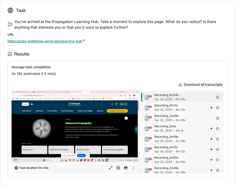
Round one, thirteen participants, moderated. It surfaced real problems. Ten of thirteen failed to scroll past the first screen of the hub, missing most of the curriculum below. The primary call to action wasn't discoverable. The word "Protocol" meant nothing to gardeners. A section labeled to suggest one thing contained another, and people bounced off it. Ten findings, each traced to something a specific participant did.
The instinct in a moment like that is to add: more signposting, more explanation, more on every screen. We tested the opposite where we could, and where the problem was language, we simply fixed the words.
Round two, twenty-four participants, unmoderated. Validation. Likelihood to use came back at 4.9 out of 5, with twenty-three of twenty-four giving a perfect score. Finding a starting lesson scored a perfect 5.0, because the label that had failed in round one now said exactly what it did. The scroll failure was gone. Overall experience landed at 4.6, with nobody below the midpoint.
One theme ran through the qualitative feedback and stuck with me: people trusted the content because it felt human. Several named the absence of generated filler as the reason they'd return. "The moment I notice AI slop, I'm out." In a landscape full of automated content, being visibly made by people who knew the subject was itself a feature.
05 / THE PLANT-TO-PROPAGATION WORKFLOW
Can someone go from a plant to knowing how to grow it, and back?
The core journey of the platform is a round trip: find a plant, learn how to propagate it, and connect the two directions seamlessly. We tested it across two starting points with thirty-nine participants, spanning complete beginners to professionals.
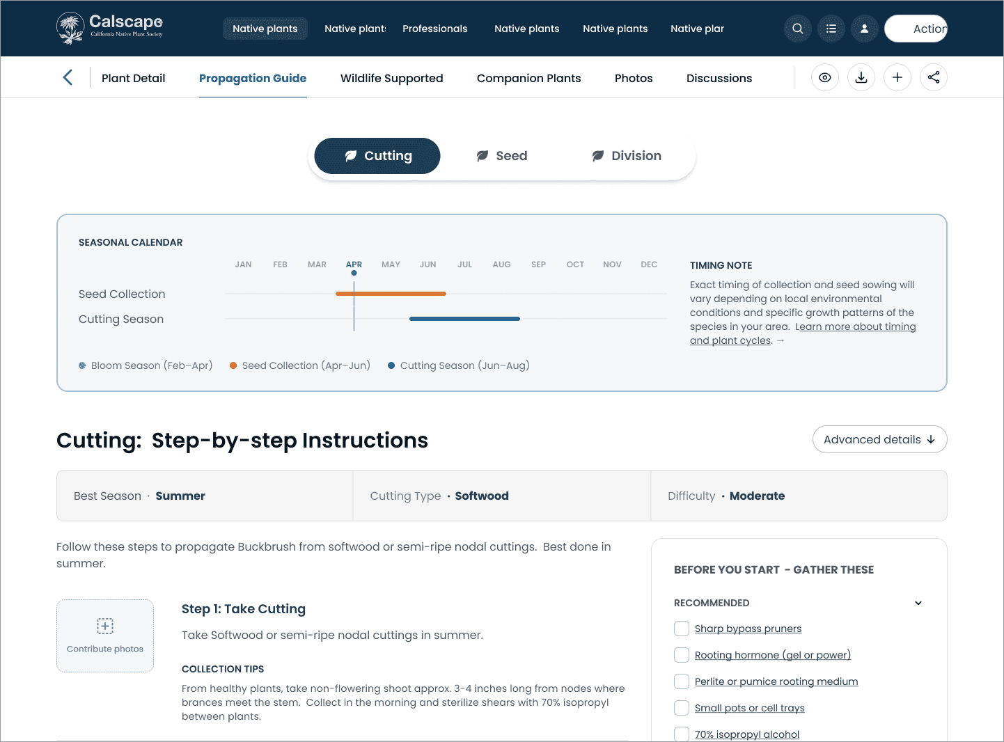
The round trip largely worked. Most people moved between a plant's profile and its propagation guide without prompting, in both directions. The redesigned guide, rebuilt into a recipe-style step-by-step format between rounds, resolved the readability complaints that had come before it and drew consistent praise across every experience level.
The standout, named by more participants than anything else, was the seasonal timing calendar: a simple visual showing when to take cuttings and collect seeds. "I loved the timeline feature. Very clear." Intent to return was among the highest scores in the study.
The friction that remained was, once again, mostly a naming problem. "My Basket" read as a shopping cart to the majority of participants, who expected checkout, not saved plants. The fix wasn't structural. It was a word.
06 / THINKING IN SYSTEMS: THE PHOTO PLATFORM
The brief was a photo uploader. The opportunity was a product.
Calscape needed a way for its community to contribute field photos of plants at each propagation stage, and a way for staff to moderate them. A photo uploader and an admin queue. Straightforward.
But looking at the shape of it, the admin tool didn't have to be a one-off. Built correctly, it was a standalone, multi-tenant product: Calscape as the first client, with the same platform licensable to other conservation organizations facing the identical problem. So the proposal I delivered wasn't just a design. It was a technical and commercial one.
Three architecture paths, each with its stack, tradeoffs, running cost, and honest assessment of commercial viability, from a fast single-app build to an enterprise microservices platform. A recommended middle path that was production-ready and licensable from day one without over-engineering. A per-organization pricing model with margin analysis. An embeddable uploader driven by dynamic field schemas, so new contribution points could be added without code changes.
This is the part of the engagement where design stopped being about screens. Calscape got the tool it needed, designed so it could also become something the organization could grow.

07 / WHAT'S NEXT: LAWN GONE
The platform was always the destination.
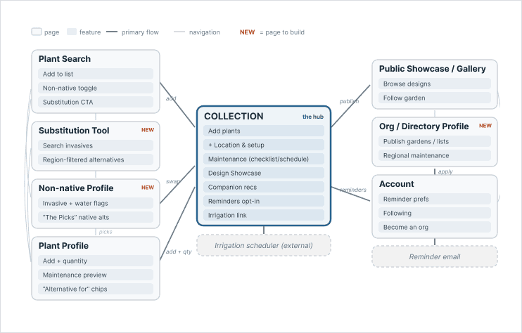
Lawn Gone is the workstream in progress now. On the surface it helps Californians replace thirsty lawns with native gardens: rebates, plant substitutions, maintenance guidance, seasonal reminders. Underneath, it's the piece that formalizes what the whole platform was building toward.
The rebate journey was the first slice I designed and prototyped, early in the engagement. What became clear is that it was never the point. It was the first feature of a much larger system: garden collections, auto-generated seasonal maintenance, a "plant this, not that" substitution tool, an organization publisher role, all of it layering onto the same core model. That system is now a defined, fixed-scope build heading into production with the development vendor.
It's live work, mid-flight. Which is the honest state of this engagement: not a finished case to admire, but a platform being designed and validated slice by slice, in real time.
08 / REFLECTION
What nine months on one platform taught me.
The words were almost always the problem.
Across every workstream, the same finding kept returning. "Protocol" confused people. A mislabeled section sent them the wrong way. "My Basket" read as e-commerce. A "Start" label looked like it launched something. Time after time, the structure tested fine and the language failed. I knew before this engagement that naming mattered. What I underestimated was how often it was the deciding factor, over layout, over visual design, over nearly everything else. A product people can't name their way through is a product they can't use, however well it's built. I test copy as seriously as I test flows now, because on this platform, copy was usually the thing that broke.
Building the system while building the products it serves is a genuine tension.
I was designing the design system and the workstreams that depended on it at the same time, inside a fixed timeline. That means committing to foundational decisions before you've fully seen how every feature will lean on them. Some of those bets I had to revise once a later workstream revealed a case the system hadn't anticipated. If I did it again, I'd sequence differently: pressure-test the system against the two most demanding workstreams before locking its foundations, rather than letting later features expose the gaps. The system held, but it held because I was willing to keep reopening it, not because I got it all right the first time.